Fall 2019 - 6 Weeks - 1,860 sqft
Individual Project
AutoCAD - Sketchup - Lumion
We were tasked with creating a brick-and-mortar store for an outdated or online brand. Milk Makeup is an NYC based makeup brand for the “low-maintenance, Millennial cool girls” and uses ingredients that are paraben-free, vegan, and cruelty-free.
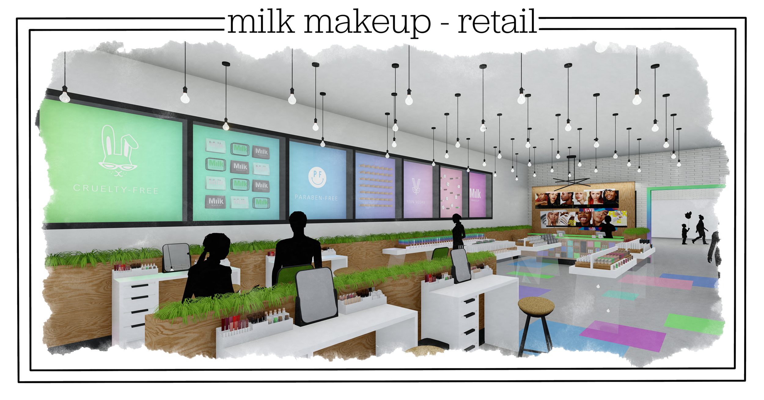
My concept was a minimalist, New York, colorful space meant to draw the customer in and grow loyalty to the brand. I wanted many areas where customers could take photos to post to social media to intrigue their followers to visit the store as well.
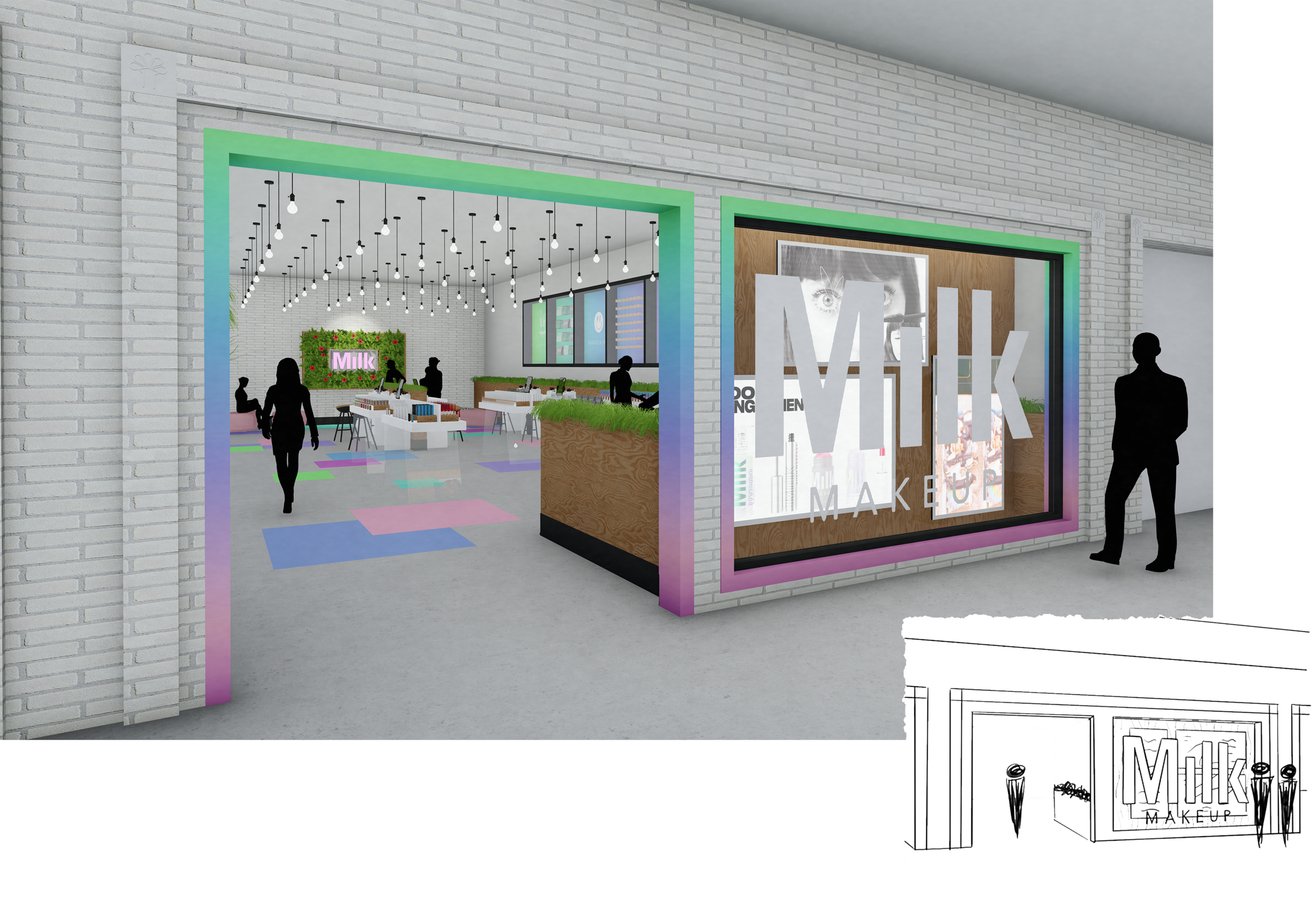
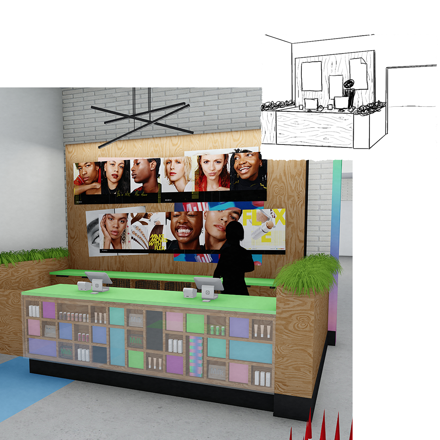
The storefront is becoming more and more important with today’s shopping environment with the draw towards online shopping. The storefront needs to excite and draw in customer’s curiosity. I decided to bring the “holographic” color gradient to the trim for the window and entrance to pop out against the white brick that is carried throughout the mall. For the window I decided to block it with the back of the transaction counter because the entrance allows the customer to view into the store. On the plywood wall on the window I placed 3 screens in varying sizes that would display Milk’s latest campaign or newest product launch.

floor plan
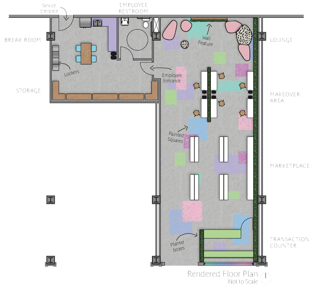
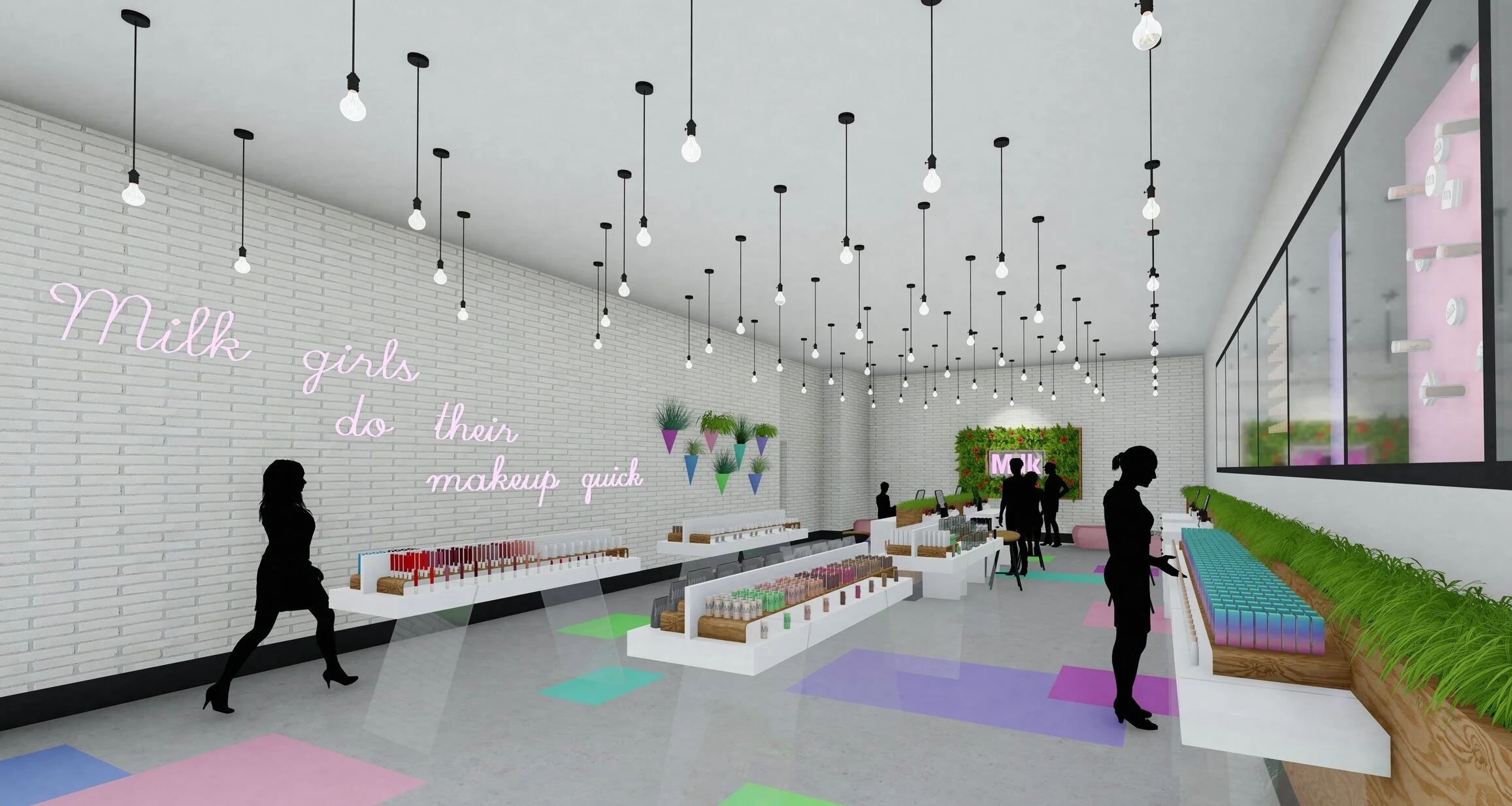
For the space planning of my store, I kept the transaction counter at the front so customers have an easy exit after purchasing their merchandise. The marketplace is kept close to the transaction counter again for ease of circulation. The makeover area is in between the lounge and the marketplace for clients to have their friends and family close by and allow the makeup artists to grab any products they need quickly. The lounge is located in the back of the store to draw people back to the feature wall. The employee area includes the employee restrooms, merchandise storage, employee lockers, and a break area. The service entrance is also in the backroom to bring in new product deliveries without bothering customers.
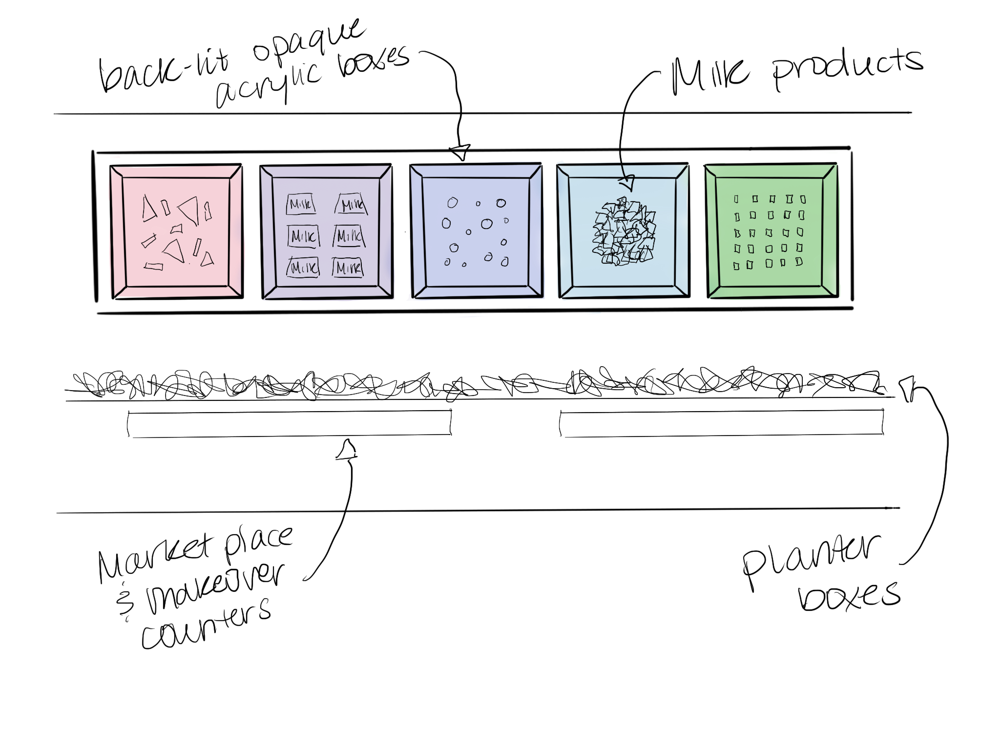
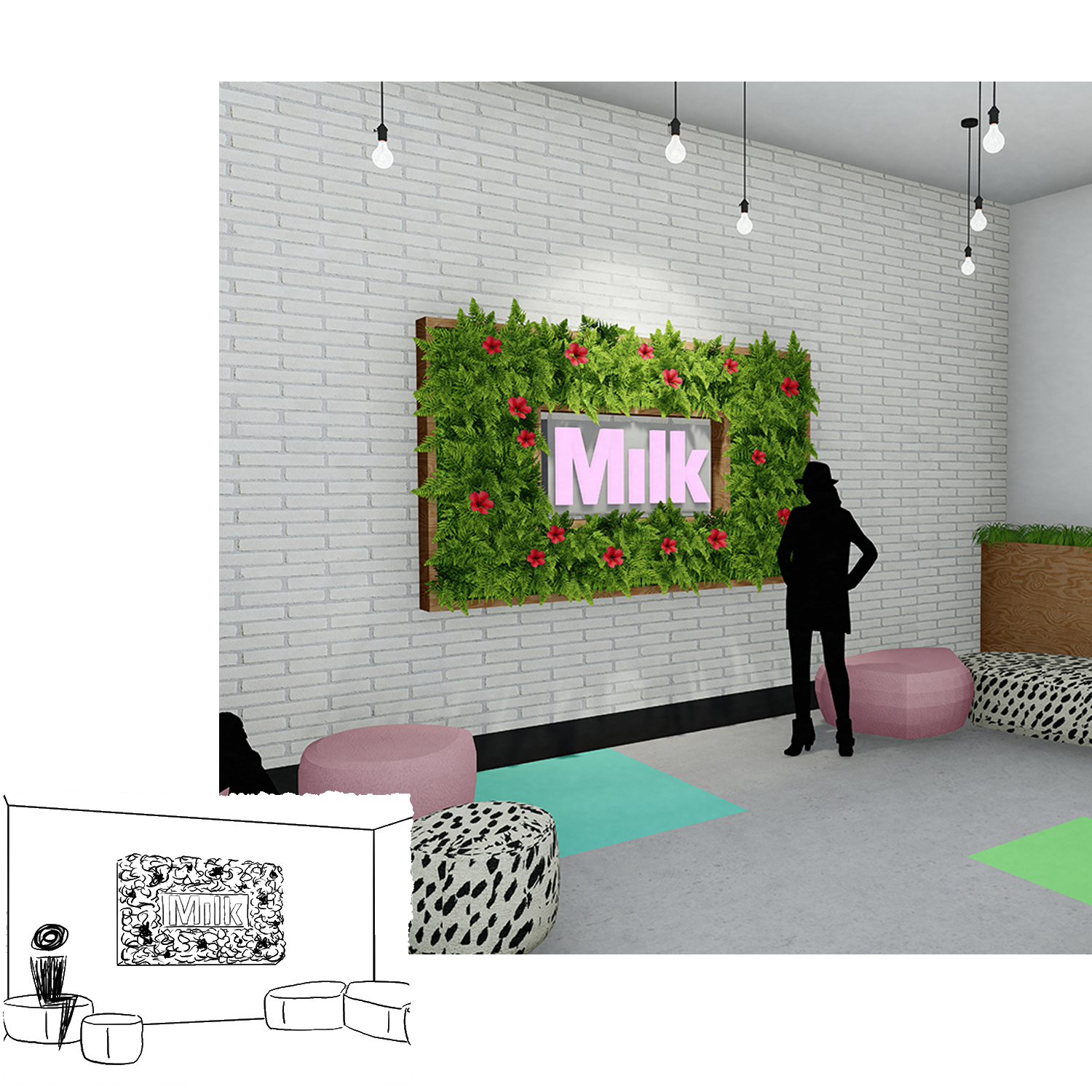
I really enjoyed using the merchandise and products as decor in the space. Milk’s packaging is very fun and colorful and lends itself easily to art installations. For the shadow box feature on the east wall, I set multiple products in the boxes as if they were defying gravity. The arrangements vary from organized to more random patterns. This feature wall also displays graphics portraying the company’s values in their products.
I also used products as a feature for the face of the transaction counter, putting them in the boxes alternating with solid color boxes. These products can be switched in and

materials and furniture
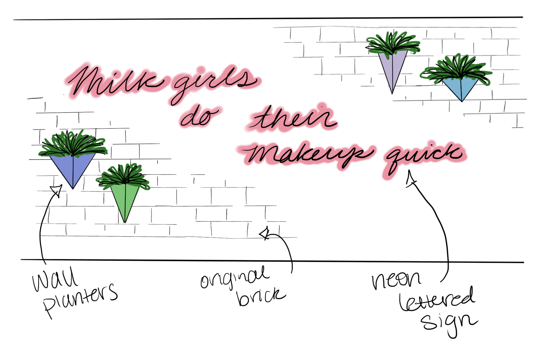
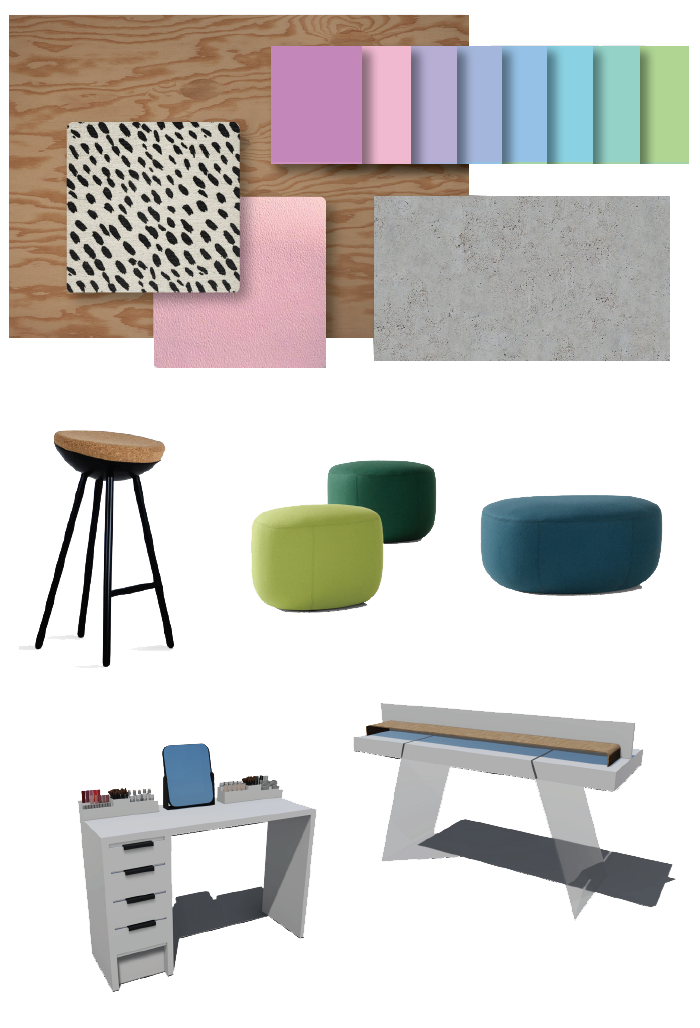
For the material palettes for the store I stuck to unfinished/natural materials mixed with bold colors and patterns. The unfinished plywood and concrete match the low-maintenance personality of Milk’s target audience and the natural cork and plants moments in the store match the brands ethical values. The bright pops of color and patterns emulate the brands fun and pop-y marketing and packaging as they are NYC based and have a more edgy style in their campaigns.
My store needed minimal furniture so I made sure to focus on the form of the pieces. For the seating I chose more simple and rounded pieces to allow them to be bold moments in the space. The makeup artist desks and the marketplace tables are both white lacquer pieces. I made sure they were simple and clean to allow the focus to be on the products or the environment. The desks include drawers and the organizers, for storage and quick access to tools and products. Some marketplace surfaces have raised platforms to highlight products and samples.
